Graphs in generativepy
Categories: generativepy
generativepy is an open-source Python drawing library that can create computer images, diagrams, and animations. It can be found on github. This article covers generativepy V50.00, although much of it will also apply to older or newer versions.
The graph module provides methods for plotting 2D graphs, mainly line graphs. Of course, Python has many good plotting libraries, including matplotlib and others. Many of them give very good results and support many different types of plots. So why does generativepy include a graphing module of its own? There are several reasons:
- If you use generativepy to create maths diagrams, it is convenient to be able to create graphs using the same library.
- If you need to add annotations to your graphs, you can do it using the same drawing techniques you use to create other maths diagrams.
- If you use generativepy to create videos or animated GIFs, it is easy to add animated graphs to those.
Graphs are just objects on the page, which allows for various advanced drawing options. For example, you can use graphs as sub-elements of another graph, like this:
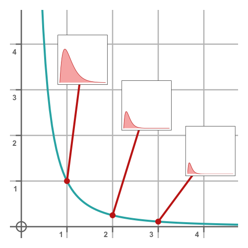
In this article, we cover basic graphs. We will cover more advanced options in a later article.
Simple axes
A generativepy graph consists of two or more separate objects:
- The graph axes, an
Axesobject. This displays the grid lines that the graph is drawn on. There is usually only one set of axes, although some advanced applications can have multiple overlapping axes. - The function plot, either a
PlotorScatterobject. There will usually be at least one function, but sometimes more. - Optionally, any additional annotations.
Unlike some graphing libraries, axes do not have text labels (such as "x" or "time") or a graph title. You can add these separately as text objects.
Here is the code to draw just the axes, without any function plots:
from generativepy.drawing import setup, make_image
from generativepy.color import Color
from generativepy.graph import Axes

def draw(ctx, width, height, fn, frame_count):
    setup(ctx, width, height, background=Color(1))

    axes = Axes(ctx, (50, 50), 400, 400)
    axes.draw()

make_image("default-axes.png", draw, 500, 500)
This code creates a 500-pixel-square image. The call to Axes sets the position of the axes to (50, 50), and the size of the axes to 400 square. This puts the axes in the centre of the page, with a 50-pixel border all round. Here is the image it creates:
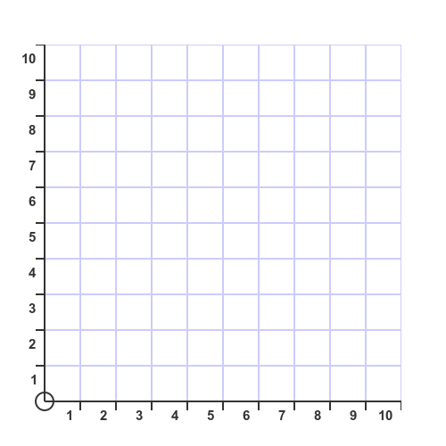
The axes range, style, and colors all use their defaults. We will see how to change them next.
Setting the extents and divisions
The default axes range from 0 to 10 in the x and y directions, but of course you can change that if you wish. Here is an example:
def draw(ctx, width, height, fn, frame_count):
    setup(ctx, width, height, background=Color(1))

    axes = (Axes(ctx, (50, 50), 400, 250).of_start((-4, -1))
                                         .of_extent((16, 5))
                                         .with_divisions((2, 1)))
    axes.draw()

make_image("extent-axes.png", draw, 500, 350)
For brevity, the imports are not included in the listing. You will notice is that the size of the graph (in the Axes constructor) is now 400 by 250. The page size in make_image has been adjusted to provide a 50-pixel border around the graph.
You will also notice some extra methods added to the constructor. of_start sets the graph coordinates of the bottom left corner to be (-4, -1). of_extent sets the range of the graph, again in graph coordinates, to be 16 in the x direction, 5 in the y direction.
This means that the x axis covers the range -4 to 12 (a length of 16), and the y axis covers the range -1 to 4 (a length of 5).
Finally, the with_divisions method sets the division spacing to 2 in the x direction and 1 in the y direction. This means that the x axis has a division line at -2, 2, 4, 6 ... and the y axis has a division line at 1, 2, 3, 4 ... Every division is numbered on the axis. Here is the result:
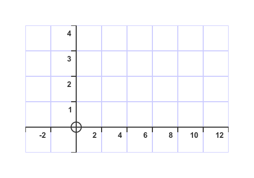
As an aside, notice that in this case the x and y axes have different scales. x has a range of 16 units over 400 pixels, so 1 unit is 25 pixels. y has a range of 5 units over 250 pixels, so 1 unit is 50 pixels. That is perfectly OK, of course, and often necessary.
In this case, we chose the x and y divisions so that they form square regions on the graph. That can look a bit neater, but you don't have to do it, it is entirely optional.
Subdivisions
Every division is labelled with a number, so it is best to keep them reasonably spaced apart (otherwise the numbers can appear too cluttered).
If you want to provide finer spacing, you can use subdivisions by adding a with_subdivisions call, like this:
def draw(ctx, width, height, fn, frame_count):
    setup(ctx, width, height, background=Color(1))

    axes = (Axes(ctx, (50, 50), 400, 250).of_start((-6, -4))
                                         .of_extent((48, 30))
                                         .with_divisions((10, 10))
                                         .with_subdivisions((5, 5)))
    axes.draw()

make_image("subdiv-axes.png", draw, 500, 350)
Subdivisions are similar to divisions except:
- Subdivisions are not numbered.
- Subdivisions can be styled differently from divisions, for example using slightly thinner lines. But you can use the same style for both if you wish.
In our case, we have used a subdivision value of 5 for the x and y subdivisions. This means each division is split into 5 equal parts, so there are 4 subdivision lines between each division. Here is how it appears:
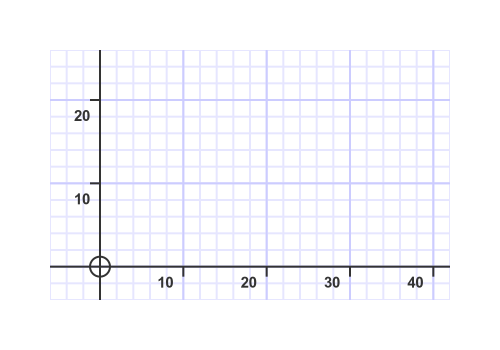
Since we are using division values of 10 and subdivisions of 5, each subdivision represents 2 units.
Styling axes
You can style the axes by setting the colours of all elements, the line styling, and the fonts used to label the axes. This can be done using the styling functions of the Axes object, like this:
def draw(ctx, width, height, fn, frame_count):
    setup(ctx, width, height, background=Color(1))

    axes = (Axes(ctx, (50, 50), 400, 250).of_start((-6, -4))
                                         .of_extent((48, 30))
                                         .with_divisions((10, 10))
                                         .with_subdivisions((5, 5)))
    axes.axis_linestyle(Color("blue"), line_width=3, cap=BUTT)
    axes.text_color(Color("blue"))
    axes.text_style(font="serif", slant=FONT_SLANT_ITALIC, size=18)
    axes.division_linestyle(Color("springgreen"), line_width=2, cap=BUTT)
    axes.subdivision_linestyle(Color("springgreen"), line_width=1, cap=BUTT)
    axes.with_border(True)
    axes.background(Color("palegoldenrod"))
    axes.draw()

make_image("style-axes.png", draw, 500, 350)
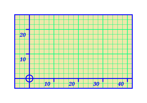
This style uses strong colors to illustrate the styling functions. You will probably want something a bit more subtle and tasteful for your own graphs. Here is what it looks like:
Some notes on the code:
axis_linestylecontrols the lines used to draw the axes and the border (see below). You can set the color and line thickness. You will usually want to set the line cap toBUTT, as shown.text_colorandtext_stylecontrol the numbers on the axes. You might typically use the axis color for text as well, but you don't have to.division_linestylesets the style for the division lines, in this case green and 2 pixels wide.subdivision_linestyledoes the same for the subdivision lines. The subdivision lines are slightly thinner than the division lines, but that is optional.with_borderset to true causes a border to be drawn around the entire graph, in the same style as the axes.backgroundsets the background color of the graph, in our case a nice bright yellow.
Plotting functions of y against x
Now that we know how to create axes, we can look at how to plot simple functions of x. Here is the code to create a simple function plot:
from generativepy.drawing import setup, make_image
from generativepy.color import Color
from generativepy.graph import Axes, Plot
import math

def draw(ctx, width, height, fn, frame_count):
    setup(ctx, width, height, background=Color(1))

    def f(x):
        return math.sin(x)

    axes = (Axes(ctx, (50, 50), 400, 250).of_start((0, -1.5))
                                         .of_extent((8,3))
                                         .with_divisions((1, 0.5)))
    axes.draw()
    Plot(axes).of_function(f).stroke(Color(1, 0, 0), 3)

make_image("plot-simple.png", draw, 500, 350)
This will create a simple plot like this:
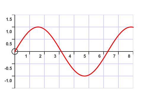
The code is similar to the earlier code for drawing axes. We have added two things:
- We have defined a function f which is the function we wish to plot. The plot function must accept a single number as a parameter and return a number as a result. In our case, the function accepts x and returns sin (x).
- We have added a
Plotobject that plots the function.
A Plot is a special type of shape. We use it like this:
Plot(axes)creates a plot object, based on our axes.of_function(f)tells the plot object to plot out function f. Notice we pass inf, the function object, rather thanf(x).- Finally, since the plot object is a shape, we need to stroke it to make it visible. We stroke it with a red line 3 units thick.
That is all we need to do to plot a simple graph.
Clipping the graph
Sometimes the plot might go outside the axes. For example, this code plots the exponential function:
def draw(ctx, width, height, fn, frame_count):
    setup(ctx, width, height, background=Color(1))

    f = lambda x: math.exp(x)

    axes = (Axes(ctx, (50, 50), 400, 250).of_start((0, 0))
                                         .of_extent((4,10))
                                         .with_divisions((1, 2)))
    axes.draw()
    Plot(axes).of_function(f).stroke(Color(1, 0, 0), 3)

make_image("plot-unclipped.png", draw, 500, 350)
Here is the graph:
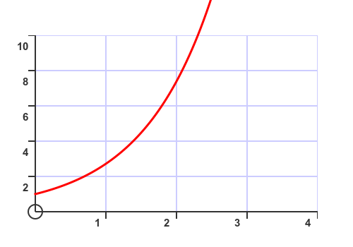
The red function plot strays outside the axes, which you usually don't want. There is an easy fix:
def draw(ctx, width, height, fn, frame_count):
    setup(ctx, width, height, background=Color(1))

    f = lambda x: math.exp(x)

    axes = (Axes(ctx, (50, 50), 400, 250).of_start((0, 0))
                                         .of_extent((4,10))
                                         .with_divisions((1, 2)))
    axes.draw()

    axes.clip()
    Plot(axes).of_function(f).stroke(Color(1, 0, 0), 3)
    axes.unclip()

make_image("plot-clipped.png", draw, 500, 350)
All we have done here is to put axes.clip() immediately before the call to Plot. We also need to call axes.unclip() straight afterwards to undo the clipping.
Here is the revised graph:
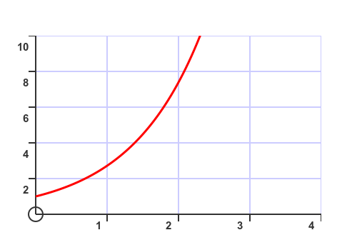
There is no particular disadvantage to using clipping even if the function doesn't go outside the axes, so you might prefer always to add the clip call.
Styling plots
The stroke call controls the plot style. We have seen how to set the color and line thickness - this works in the same way as drawing other shapes.
You can also create other line effects, such as dashed lines, the same way you would for any other shape. For example, here is a thick, dashed line:
def draw(ctx, width, height, fn, frame_count):
    setup(ctx, width, height, background=Color(1))

    f = lambda x: math.sin(x)

    axes = (Axes(ctx, (50, 50), 400, 250).of_start((0, -1.5))
                                         .of_extent((8,3))
                                         .with_divisions((1, 0.5)))
    axes.draw()
    Plot(axes).of_function(f).stroke(Color(1, 0, 0), 4, dash=[8, 8])

make_image(FOLDER + "plot-dotted.png", draw, 500, 350)
Here is the result:
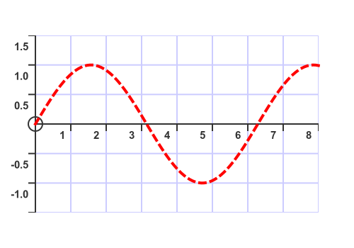
Dashed and dotted lines are explained in the drawing article.
You can also fill a plot, but using the fill function directly usually doesn't give a good result. We'll cover the extra step of defining the exact fill region in a later article on advanced plotting.
Plotting multiple graphs on the same axes
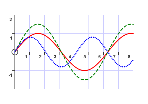
We can plot multiple graphs on the same axes. To do this, we use Plot several times using different functions. It is usually a good idea to style each plot differently. Here is an example:
def draw(ctx, width, height, fn, frame_count):
    setup(ctx, width, height, background=Color(1))

    f = lambda x: math.sin(x)
    f1 = lambda x: 1.5*math.sin(x)
    f2 = lambda x: 0.8*math.sin(1.5*x)

    axes = (Axes(ctx, (50, 50), 400, 250).of_start((0, -2))
                                         .of_extent((8,4))
                                         .with_divisions((1, 1)))
    axes.draw()
    Plot(axes).of_function(f).stroke(Color(1, 0, 0), 3)
    Plot(axes).of_function(f1).stroke(Color(0, 0.5, 0), 3, dash=[8, 8])
    Plot(axes).of_function(f2).stroke(Color(0, 0, 1), 3, dash=[0, 6], cap=ROUND)

make_image(FOLDER + "plot-multiple.png", draw, 500, 350)
Here, we have created three functions f, f1, and f2 that are all sine functions with different amplitudes and periods.
We use Plot three times, once for each function. The color is set to red, green and blue for f, f1, and f2, with the green line dashed and the blue line dotted.
Here is the result:
Related articles
Join the GraphicMaths Newsletter
Want article discussions, announcements, and discounts on GraphicMaths books and products? Join the newsletter:
Popular tags
adder adjacency matrix alu and gate angle answers area argand diagram binary maths cantor cardioid cartesian equation chain rule chord circle cofactor combinations complex modulus complex numbers complex polygon complex power complex root cosh cosine cosine rule countable cpu cube decagon demorgans law derivative determinant diagonal differential equation directrix dodecagon e eigenvalue eigenvector einstein ellipse equilateral triangle erf function euclid euler eulers formula eulers identity exercises exponent exponential exterior angle first principles flip-flop focus gabriels horn galileo gamma function gaussian distribution gradient graph hendecagon heptagon heron hexagon hilbert horizontal hyperbola hyperbolic function hyperbolic functions infinity integration integration by parts integration by substitution interior angle inverse function inverse hyperbolic function inverse matrix irrational irrational number irregular polygon isomorphic graph isosceles trapezium isosceles triangle kite koch curve l system lhopitals rule limit line integral locus logarithm maclaurin series major axis matrix matrix algebra mean minor axis n choose r nand gate net newton raphson method nonagon nor gate normal normal distribution not gate octagon or gate parabola parallelogram parametric equation pentagon perimeter permutation matrix permutations pi pi function polar coordinates polynomial power probability probability distribution product rule proof pythagoras proof pythagorean triple quadrilateral questions quotient rule radians radius rectangle regular polygon rhombus root sech segment set set-reset flip-flop simpsons rule sine sine rule sinh slope sloping lines solving equations solving triangles special relativity speed of light square square root squeeze theorem standard curves standard deviation star polygon statistics straight line graphs surface of revolution symmetry tangent tanh transformation transformations translation trapezium triangle turtle graphics uncountable variance veridical paradox vertical volume volume of revolution xnor gate xor gate