Statistics overview
Categories: statistics probability

Modern life is awash with data, especially since the internet has become a part of our everyday lives.
The problem with data is that, in itself, it doesn't necessarily tell us anything useful. We need to convert that data into information. Statistics is the science of converting data into information.
The primary way statistics does this is by modelling the information. Models can be very simple or quite complex, but in every case, they serve to extract useful information from the data to allow us to gain insights, make predictions, and ultimately benefit from the wealth of information that modern technology offers us.
Types of data
We typically gather raw data by observing or measuring a variable. There are different types of variables, and we will see examples of the three main types in this article.
Example 1 - a large company, with 5000 employees, has a record of how much each employee earns. This data is numerical. We sometimes call this quantitative data. This data is also continuous in nature. An employee will typically earn tens of thousands of pounds (or more), correct to the nearest penny, so their salary is specified to 7 or more digits. That is, for all intents and purposes, a continuous quantity. We say that salary is a continuous, numerical value.
Example 2 - a local shoe shop keeps a record of the number of shoes it sold last month, including how many shoes of each size were sold. Shoes sizes are numbers, and they have an order - the bigger the number, the bigger the shoes. So the data is numerical and quantitative. But shoe sizes are integers. Shoe sizes are not a continuous number, they have discrete values. We say that shoe size is a discrete numerical value.
Example 3 - a traffic survey has an observer recording the traffic driving past a particular point on a road, for an hour, at a particular time on a particular day. They observe the type of vehicle (for example, they might categorise each vehicle as either a bicycle, motorbike, car, van, lorry, or bus) and count the number of each type. This data is not numerical. We say that it is categorical or qualitative.
These are the three main types of data. They all have one thing in common - in their raw form, they are just a huge list of individual values that are of no use to anybody. We need to apply statistical analysis to get the most use out of the data.
Describing data - average value
If we are faced with a long list of data points, for example, the salaries of 5000 employees, it can be quite difficult to gain any real understanding of what the numbers mean.
As we said earlier, a good way to gain insights is to make a simple model of the data. One of the simplest useful models is the average value. The average asks the question "If all the values were the same, what value would that be?" We can think of this as being the location of the centre of the data.
We can find the average salary of an employee by adding up all of their salaries and then dividing the total by the number of employees. The value we obtain won't tell us very much. It is just one number, some part-time workers will be earning a lot less whereas the CEO might be earning 100 times more.
But the information still has its uses. It gives us some insight into the position of a typical employee. It allows us to find the company's total salary bill costs (average salary times the number of employees). And we can compare the average salaries of different companies to gain some information about them. Your interpretation of those figures might differ, depending on whether you are a prospective employee or an investor.
Other types of average
Before we move on from averages, it is worth remembering that there are several different types of averages. The one described above is the mean average, of course.
The median is a slightly different type of average. In that case, we would take the list of 5000 salaries, arrange them in order, and then choose the middle person (number 2501 in the list). Loosely speaking, the median has the property that half the group are paid less than or equal to that salary, and half the group are paid greater than or equal to that salary.
The median probably won't be the same as the mean salary, and in some cases might be very different. The median has two advantages. Firstly, it isn't affected by outliers. If the CEO is earning millions, that would increase the mean average, which could be regarded as being unrepresentative, because it is just one person. The mean salary is completely unaffected by the CEO's salary.
The second advantage comes into play when we consider the case of the shoe shop. The mean shoe size might be (for example) 7.83, which of course is not a valid shoe size. It is the mean average, but it sounds quite odd. To find the median, we line up all the shoes in order of size and then pick the middle one. That will always be an actual pair of shoes, so it will have a valid size. In this example, it might be 8, or maybe 7.
There is a third type of average, the modal average. This corresponds to the most frequent value. This is particularly useful for categorical data, such as the example of counting vehicle types. Since the vehicle type isn't a number we can't calculate the mean or median. But we can say which type of vehicle was seen most often. So, for example, we might find that cars are the most frequent vehicle type seen on a particular road.
We can find the modal average of shoe sizes too. That would represent the most frequently sold size of shoe. We can't usually find the modal average of a continuous variable such as salary. That is because employees even on the same grade will often have slightly different salaries for various reasons. Even if their salaries differ by a penny, they will not count as being the same. Modal values aren't usually useful for raw continuous variables.
Describing data - variability
The average value doesn't tell the whole story. It is also useful to know the variability of the data.
One simple measure of variability is the range of values. For example, for the company employees, in addition to the average salary we might also quote the lowest and highest salaries. The problem with a range is that it can be misleading. For example, a few highly paid executive employees might earn far more than the other employees, and a few trainees might earn far less.
Another measure is the standard deviation. This is a single value that indicates the spread of the values taking every value into account. This works well for distributions that are close to a bell shape (such as the normal distribution, below), but it can be misleading in other cases.
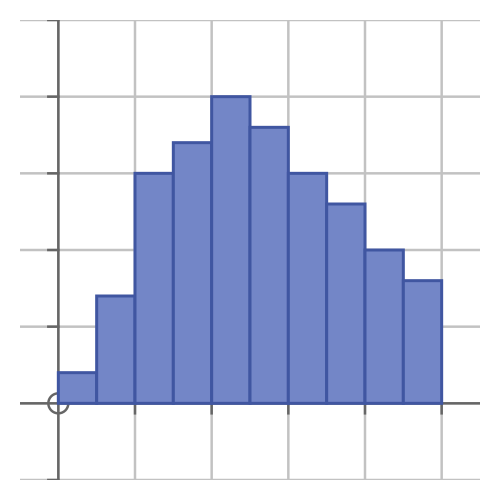
Another method is to create a histogram. In the employee example, we would divide the salaries into n equal ranges (or bands). Every employee would earn a salary that fell within one of the n bands. We would count up the number of employees in each band and plot that as a histogram (a little like a bar chart) see below.
Graphs
One of the most important benefits of statistics is that it allows us to make sense of large amounts of data. And of course, this also allows us to explain the key points of a data set to other people.
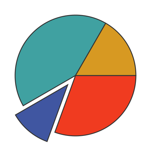
Graphs, of course, are a great way to present statistical information visually. There are quite a few different graphs we can use to present statistical data, and we will look at a few examples here. We will start with the well-known pie chart.
This is often used to illustrate the relative sizes of different subsets of a population. For example, it could be used to represent the number of cars, bicycles, buses, etc observed in the traffic survey. Each type is represented by a different area in a different colour. This graph is often more intuitive and impactful than a list of numbers:

Another common graph is the histogram. To take our employee salary data as an example, the x-axis represents the range of salaries, from the minimum to the maximum. We divide the range into several sub-ranges, each represented by a bar:

The y-axis represents the number of employees in each salary band. This means that the area of each bar indicates the total amount of money paid to the employees in that band.
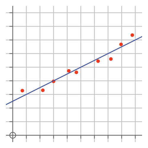
Sometimes we are dealing with two different variables that we think might be related. For example, we might suspect that shoe size and height could be related. A scatter chart can be used to illustrate that type of correlation:

Each point represents a single sample (ie an individual person if we were potting height vs shoe size). We would use the x-axis to represent one variable, and the y-axis to represent the other. Any correlation would be visible from the graph.
The graph above also shows a line, fitted to the points. We use the regression to find the best-fitting line or curve, see later.
Probability
Probability is closely related to statistics and provides its theoretical basis. To some extent, we can think of statistics as being applied probability theory.
We often use statistics to calculate the probability of a certain event occurring, for example, to evaluate risks. We also use probability and combinatorics to analyse sample spaces - the set of all possible outcomes.
We use probability rules to find statistics related to multiple events occurring together, any one of a set of events occurring, or an event not occurring. We also use Bayes theorem to find probabilities of one event occurring given that another event occurred.
Sampling
It is sometimes impractical or simply not worthwhile to measure or observe every person or item in a population. For example, many governments will perform a full census of the population, typically once every 10 years, but that isn't something that could be done frequently as it is expensive and a burden on the population. If a marketing company wishes to discover the nation's favourite type of fizzy drink, or a political party wants to gauge the public reaction to their latest plan to ban something or other, they can't ask everybody. Instead, they will just ask a small sample of people.
There are two potential problems with sampling. The first is bias. If we select a subset of people that is not truly random, then we will be measuring the opinions of that group of people. That might not match the views of the wider population.
This problem can be addressed to some extent by selecting people at random, called random sampling. An alternative is systematic sampling, where we might have a list of people, and survey every nth person on the list. However, even random sampling can have hidden biases. For example, we conduct a survey by interviewing passers-by in the high street, say on a Tuesday afternoon. Our survey would then tend to under-represent people who work normal office hours because they won't be out on the high street at that time.
An alternative is to divide the population into groups and take random samples from each group, so we can make sure we have fair numbers of people from each group. This is called stratified sampling.
This doesn't just apply to opinion polls, of course. Another example is product testing on a production line. It is common in a factory to periodically take a product off the production line and test that it meets its specifications. It is usually impractical to test for every item, so the testers have to take steps to ensure they are testing a representative sample
Inference
We can use statistics to make inferences about the data. These are facts or likelihoods about the data that are not necessarily obvious without further analysis.
A simple form of inference is regression. This is used to predict the value of a variable based on the values of one or more other variables. With linear regression we assume that the relationship is a straight line. We find the straight line that best fits our available data, then we can use the line to predict other values. This was illustrated earlier.
There are other types of regression, for example fitting a polynomial curve rather than a straight line.
Confidence intervals are a form of inference applied to population samples. For example, if a survey gathers answers from 2000 people, it is possible to calculate a level of confidence in the result.
Another form of inference is hypothesis testing. For example, suppose a particular road has a higher-than-average number of accidents. Reducing the speed limit is a possible solution, so the authorities might set a lower speed limit for a trial period. They then need to know whether the reduced speed limit worked, so they know whether they should keep the speed limit or investigate other solutions instead.
If accidents are fairly infrequent, it might not be obvious if the speed limit made a difference. For example, if there were 5 accidents when you might have expected 6, that isn't necessarily proof, because that might have happened by chance. Hypothesis testing allows us to decide objectively if the experiment showed a statistically significant improvement.
Probability distributions
A probability distribution is a more complex and realistic model that can be applied to data to gain a more comprehensive understanding of its properties.
Typically, a probability distribution has three characteristics:
- It is an idealised function with nice mathematical properties, so we can easily calculate its properties and compare it with other data sets.
- Its shape is a reasonable fit for many typical real-life distributions.
- It has one or more parameters that allow it to be fitted to a real data set.
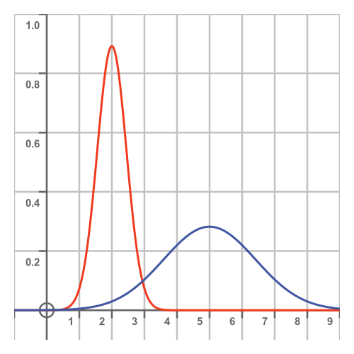
So, for example, if our data set looks something like a Normal distribution with a mean value μ and a standard deviation σ, then we can use the normal distribution to represent it. We then immediately know lots of things about the data, because they are standard results for that distribution. The predictions won't be exactly correct, because the data isn't an exact match, but it will often be good enough for many purposes.
The Normal distribution, also known as the Gaussian distribution, is a classic bell curve. Many data sets look approximately like a Normal distribution:

This immediately gives us the ability to use many standard results that are known for the Normal distribution. It could also give us a better comparison with other companies that also had a normal distribution of salaries.
A second common probability distribution is the binomial distribution. This represents the distribution of outcomes of random experiments and by extension the probability of each possibility occurring. For example, if we throw a dice three times, what is the probability that they will all be sixes? This can also be applied to random selections from a population. For example, if we pick two employees of our example company at random, what is the probability they will both earn a six-figure salary?
A final common probability distribution that we will consider is the Poisson distribution. This covers events that happen at random times, but where the average number of events per unit of time is fixed. For example, we might know from past observations that, on Monday afternoons, 120 vehicles pass our observation point every hour. But the flow is random, so there might be several minutes when no vehicles pass followed by several cars all bunched together.
The binomial and Poisson distributions both assume that the events are random. In reality, this might not always be strictly true. For example, a slow-moving vehicle will slow down the traffic behind it. This will cause a gap in traffic, followed by a group of closely packed vehicles that have been held up by the slow-moving vehicle. But those events are not independent and random, because they are both caused by the slow-moving vehicle. This means that the binomial or Poisson distributions are idealised approximations to the actual situation.
Join the GraphicMaths Newsletter
Sign up using this form to receive an email when new content is added to the graphpicmaths or pythoninformer websites:

Popular tags
adder adjacency matrix alu and gate angle answers area argand diagram binary maths cardioid cartesian equation chain rule chord circle cofactor combinations complex modulus complex numbers complex polygon complex power complex root cosh cosine cosine rule countable cpu cube decagon demorgans law derivative determinant diagonal differential equation directrix dodecagon e eigenvalue eigenvector ellipse equilateral triangle erf function euclid euler eulers formula eulers identity exercises exponent exponential exterior angle first principles flip-flop focus gabriels horn galileo gamma function gaussian distribution gradient graph hendecagon heptagon heron hexagon hilbert horizontal hyperbola hyperbolic function hyperbolic functions infinity integration integration by parts integration by substitution interior angle inverse function inverse hyperbolic function inverse matrix irrational irrational number irregular polygon isomorphic graph isosceles trapezium isosceles triangle kite koch curve l system lhopitals rule limit line integral locus logarithm maclaurin series major axis matrix matrix algebra mean minor axis n choose r nand gate net newton raphson method nonagon nor gate normal normal distribution not gate octagon or gate parabola parallelogram parametric equation pentagon perimeter permutation matrix permutations pi pi function polar coordinates polynomial power probability probability distribution product rule proof pythagoras proof quadrilateral questions quotient rule radians radius rectangle regular polygon rhombus root sech segment set set-reset flip-flop simpsons rule sine sine rule sinh slope sloping lines solving equations solving triangles square square root squeeze theorem standard curves standard deviation star polygon statistics straight line graphs surface of revolution symmetry tangent tanh transformation transformations translation trapezium triangle turtle graphics uncountable variance vertical volume volume of revolution xnor gate xor gate
